Past and Present Projects
From sleek logos to head-turning brand campaigns, this is where strategy meets style and creativity runs wild. Each project is a glimpse into the kind of bold, scroll-stopping visual storytelling we bring to life for our clients.
Ready for some eye candy? Let’s dive in.
Re-Brand
Brand Design | Tagline Development
Fox Insurance came to us needing a fresh, professional identity that reflected their depth of services and approachable expertise. The goal? A modern, confident brand that could stand strong across multiple insurance lines—property & casualty, employee benefits, and marine—while still feeling trustworthy and local.
The final logo subtly incorporates a fox tail motif into the letter “O,” paired with flowing lines that nod to both waves (for marine) and flexibility (a nod to tailored service). The sleek serif typography is balanced by a calming yet confident color palette of navy and teal. The supporting tagline—“smart. strategic. secure.”—reinforces their brand pillars and speaks directly to the mindset of their ideal client.
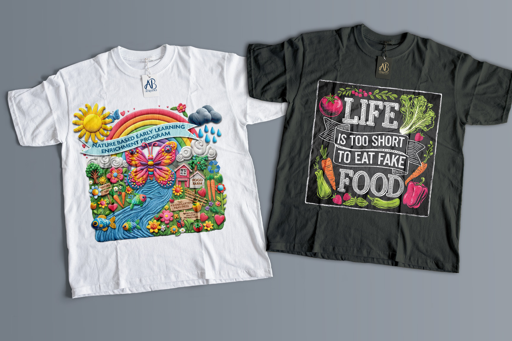
T-Shirt Designs
Illustration
These custom t-shirt designs were created for two of The Healthy Earth Org’s community programs. The vibrant white tee celebrates their Nature-Based Early Learning Enrichment Program, designed to engage young minds through outdoor play, gardening, and environmental awareness. The whimsical illustration brings nature to life with a butterfly, rainbow, and garden scene—perfectly tailored for curious little learners.
The charcoal tee supports their Eat Real, Grow Local gardening initiative, using bold typography and fresh veggie illustrations to drive home the message: “Life is too short to eat fake food.” It’s fun, memorable, and designed to inspire healthier choices in a stylish, farmer’s market–approved kind of way.

Awareness Campaign
Campaign Branding | Campaign Collaterals
To boost participation in the City of Cape Coral’s Adopt-A-Road program, I developed a full awareness campaign for Keep Lee County Beautiful that was both informative and action-driven. The campaign centered around the custom-branded slogan, “Keep it Clean. Keep it Green.”—a bright, approachable identity designed to stand out and stick.
Deliverables included a campaign logo, rack card, press release, and a full suite of 12 social media posts with custom graphics and educational content. Messaging focused on volunteer recruitment, environmental impact, and community pride, making it easy for residents to get involved and feel empowered to make a difference in their own neighborhoods.
From visuals to voice, this campaign was all about turning civic duty into community energy.
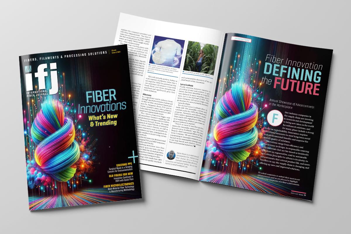
Cover Artwork & Layout^
Cover Illustration | Magazine Layout
As the Art Director for International Fiber Journal, published by Driven by Design LLC, I conceptualized and designed this dynamic cover featuring a vibrant, AI-generated visual. The design reflects the theme of “Fiber Innovations: What’s New & Trending,” blending bold creativity with industry relevance. In addition to the cover, I laid out the editorial articles within the magazine, ensuring a cohesive and polished presentation that aligns with the publication’s professional standards. This project highlights my ability to blend cutting-edge technology with compelling design to deliver a standout publication piece and also includes the layout of the magazine’s editorial articles.
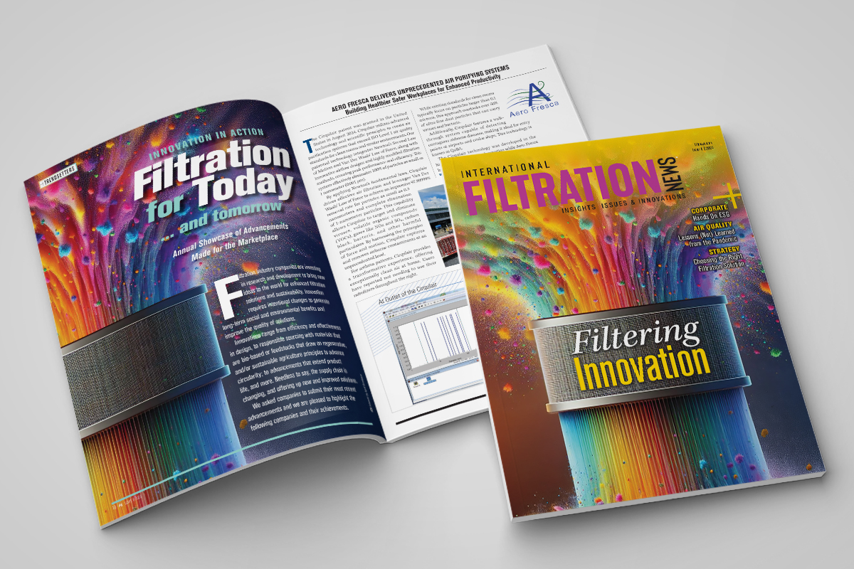
Cover Artwork & Layout^
Cover Illustration | Magazine Layout
Serving as Art Director for International Filtration News, published by Driven by Design LLC, I created this striking cover design, anchored by a colorful, AI-generated image symbolizing the theme of “Filtering Innovation.” The dynamic interplay of colors and textures illustrates the advanced filtration processes while evoking a sense of energy and creativity. Designed to highlight industry trends, this cover merges technical precision with artistic flair, offering a visually compelling introduction to the issue’s content. My role extended beyond the cover to include the layout of all editorial articles, crafting a visually engaging and seamless reader experience throughout the magazine while maintaining a professional and innovative aesthetic.
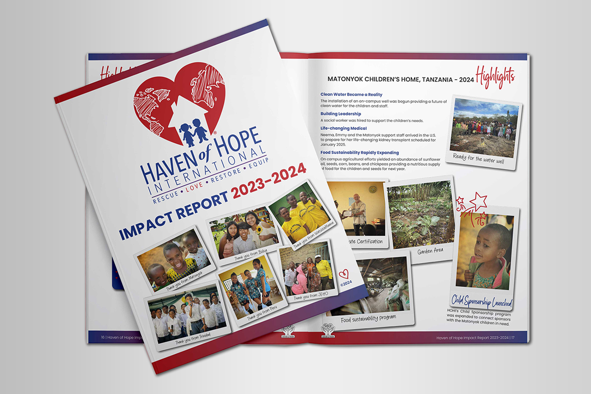
Annual Report
Publication Design & Layout | Art Direction
Designed Haven of Hope International’s “Impact Report – 2023,” featuring photos of the children from orphanages styled as retro Polaroids to evoke nostalgia, and emotions and inspire donations. Hand-drawn doodles added a touch of whimsy, balancing the design to feel heartfelt and approachable rather than overly corporate. The report was so well-received that the client expanded it to include their annual report for 2023 – 2024.
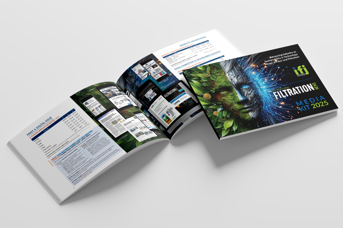
Media Kit^
Cover Artwork Design | Layout Design
Crafted an original cover design for the International Fiber Journal and International Filtration News Media Kit in collaboration with Driven by Design LLC. The project also included layout design, seamlessly integrating the cover’s elements and colors throughout the pages to create a cohesive and unified look for the media kit.
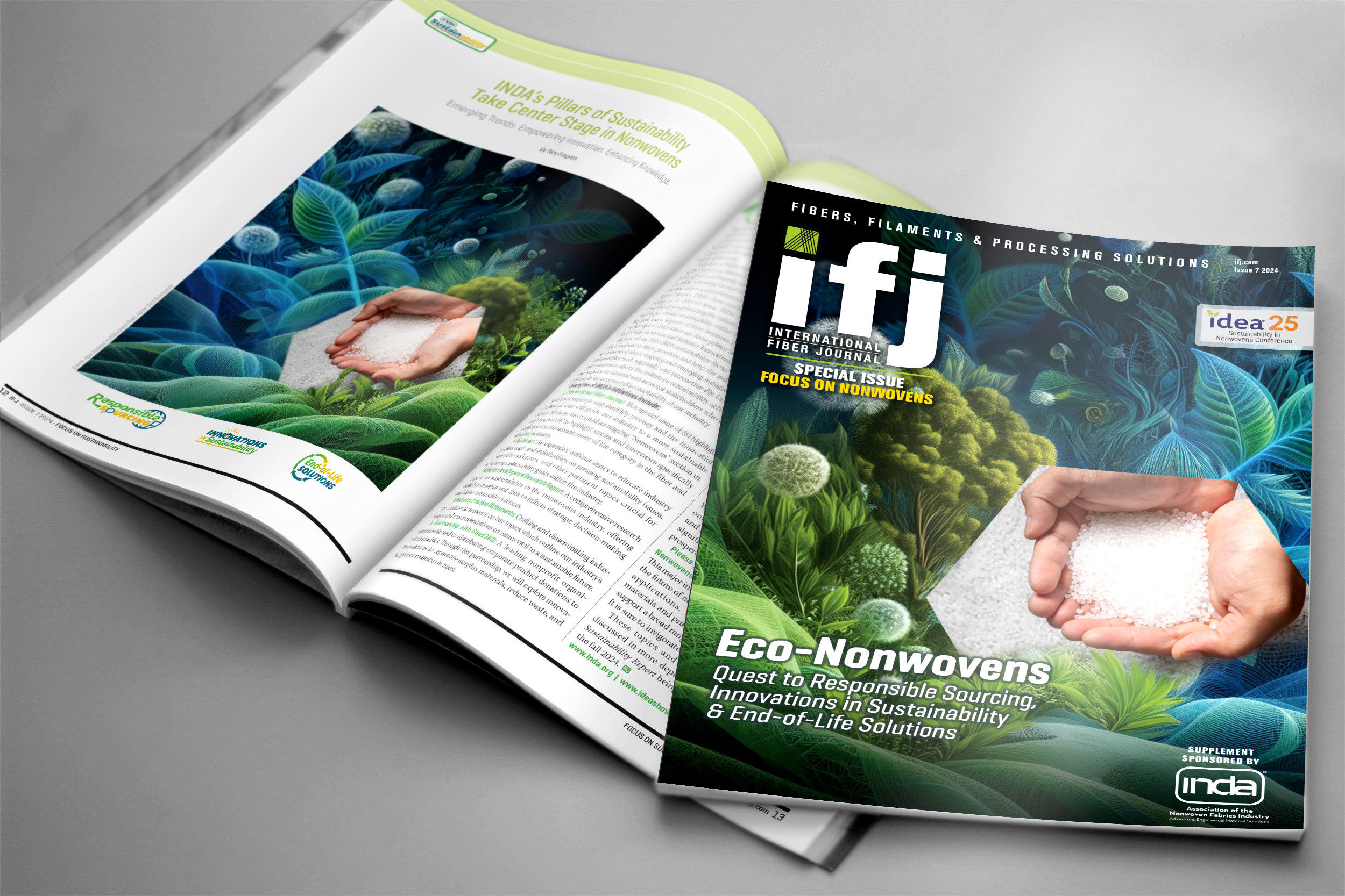
Cover Artwork^
Cover Artwork Design | Illustration
As Art Director for International Fiber Journal, published by Driven by Design LLC, I spearheaded the creative direction for this special issue cover, featuring a visually rich and eco-inspired design that highlights the theme, “Eco-Nonwovens: Quest to Responsible Sourcing, Innovations in Sustainability & End-of-Life Solutions.” In addition to the cover, I laid out all editorial articles within the magazine, ensuring an engaging and cohesive presentation that aligns with the publication’s professional tone and audience expectations.
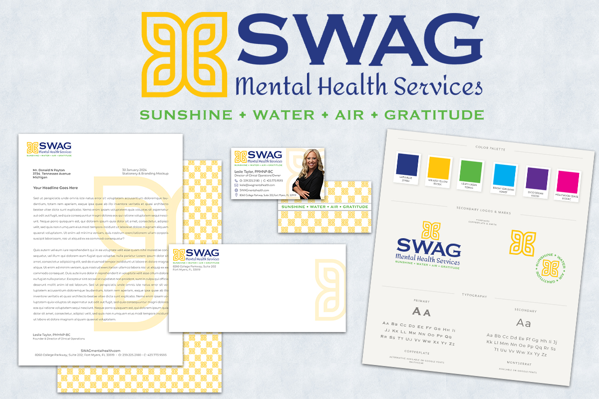
Brand Identity
Brand Identity | Marketing Collaterals
Designed a brand identity for a mental health practitioner dedicated to empowering others to live joyful, fulfilled lives. At the heart of the design is an abstract, Celtic-inspired butterfly, symbolizing transformation, resilience, and interconnectedness. We created a harmonious visual story by incorporating SWAG elements—sunshine, water, air, and gratitude. A bright, bold color palette ties it all together, reflecting vibrancy, positivity, and the practitioner’s mission to inspire growth and well-being.
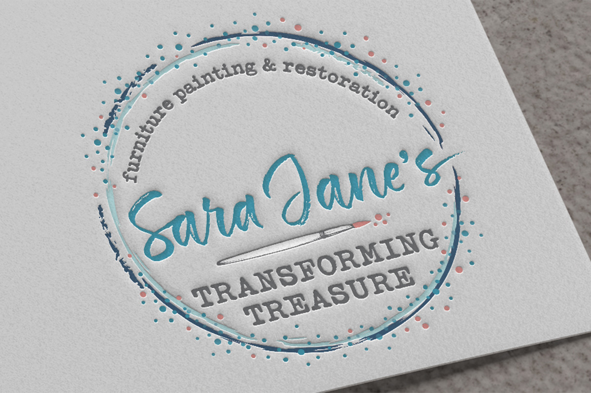
Brand Identity
Logo Design
Created a mini-brand identity for a furniture restoration and refinishing business, featuring a colors inspired by the local area. The design incorporates a brush stroke circle, paint drops and a paintbrush, symbolizing the craft and creativity of the business
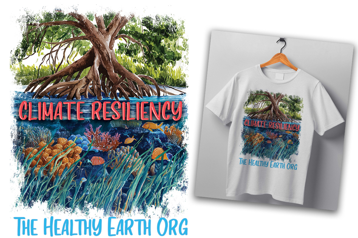
T-Shirt Design
Illustration
Another exciting project for The Healthy Earth Org! This bespoke t-shirt design highlights the critical role mangroves play in coastal protection. The vibrant artwork beautifully illustrates nature’s resilience, featuring strong mangrove roots, thriving coral reefs, and lush seagrass—all working together to safeguard coastlines from storms and erosion.
Logo Design
Brand Refresh | Logo Design
Designed a clean and professional logo for an accounting firm, featuring the initials ‘MLL’ in a modern, serif font encased in a sleek, circular emblem. The subtle gradient adds depth, reflecting the firm’s commitment to precision and trustworthiness.
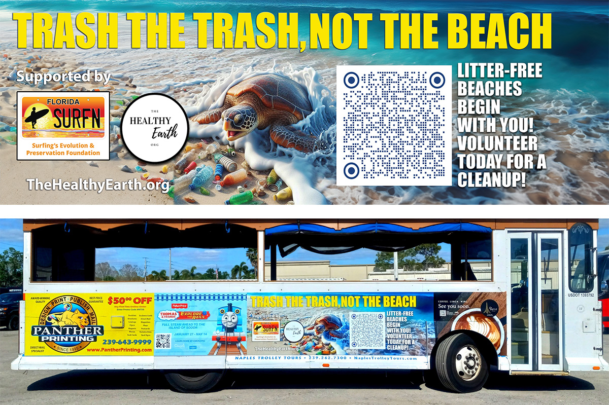
Trolley/Bus Ad+
Illustration/Large Format Design
This impactful trolley bus ad was designed for a nonprofit dedicated to preserving our SWFL paradise. I created an illustration centerpiece featuring a powerful image of a sea turtle surrounded by beach litter, driving home the need for action. The tagline I developed, ‘Trash the Trash, Not the Beach,’ reinforces the call to keep our shores clean. The design merges visual storytelling with a strong message, encouraging community responsibility and inspiring volunteers to join cleanup efforts.
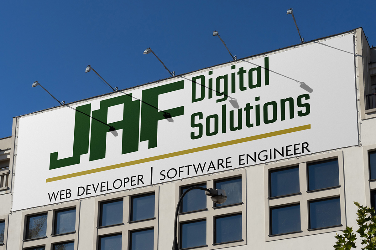
Logo+
Mini-rebrand
This logo design project was created for a client focused on website design and software engineering. The goal was to develop a logo that reflects the client’s tech-savvy expertise while appealing to their love for classic aesthetics. Drawing inspiration from the pixelated charm of retro video games, I crafted a design featuring a bold, geometric font reminiscent of vintage arcade graphics, blending nostalgia with modern functionality.
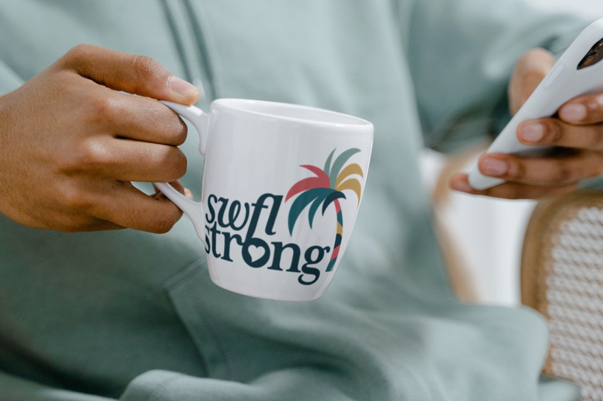
Rebrand*+
Brand Refresh
For the rebrand of SWFL Strong, we designed a fresh brand identity that aligns with their mission of connecting the community. The new logo features a palm tree, symbolizing both the local identity of Southwest Florida and the resilience of the community—strong enough to “bend, not break” in the face of storms.
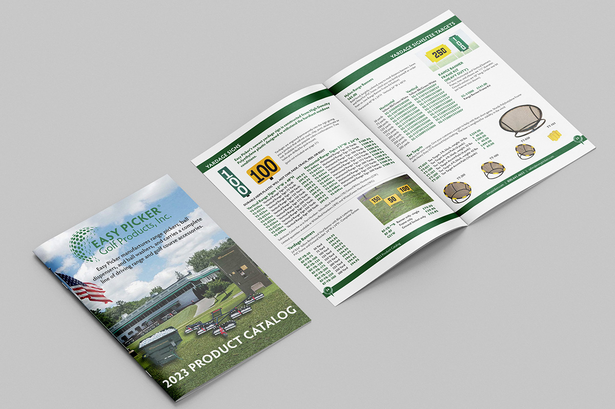
Golf Product Catalog*
Design Direction | Catalog Layout
Comprehensive 100-page product catalog, leveraging content supplied by the client effectively showcasing the diverse range of golf products in a compelling and unified manner.
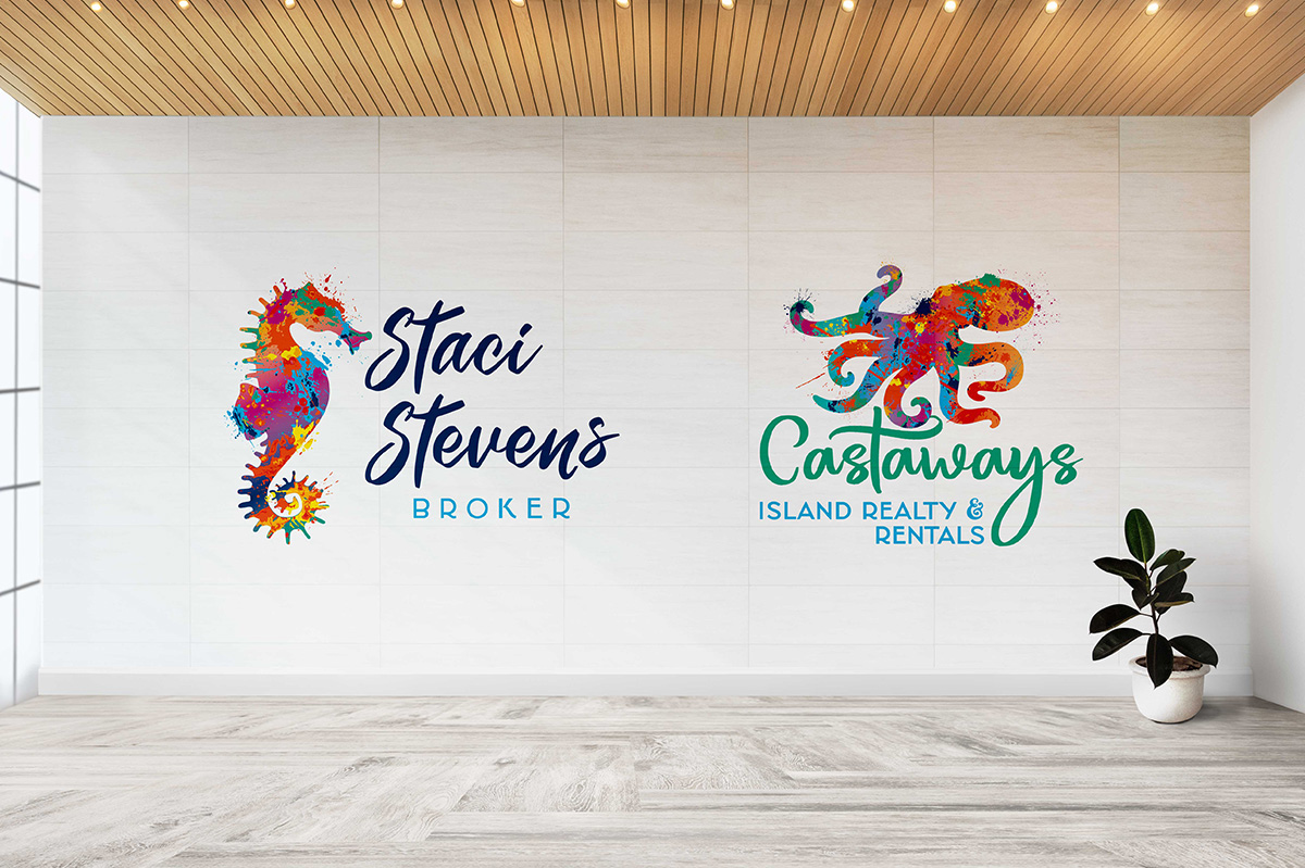
Brand Identity and a Rebrand*
Branding | Logo Design | Illustration
This project was two projects for the same client. The first was to brand the client to define her personal brand and establish an online presence. Once the acquisition of the agency she was affiliated with, she desired a rebrand to align with her personal brand done previously. The result is two brands that create a harmonious union.
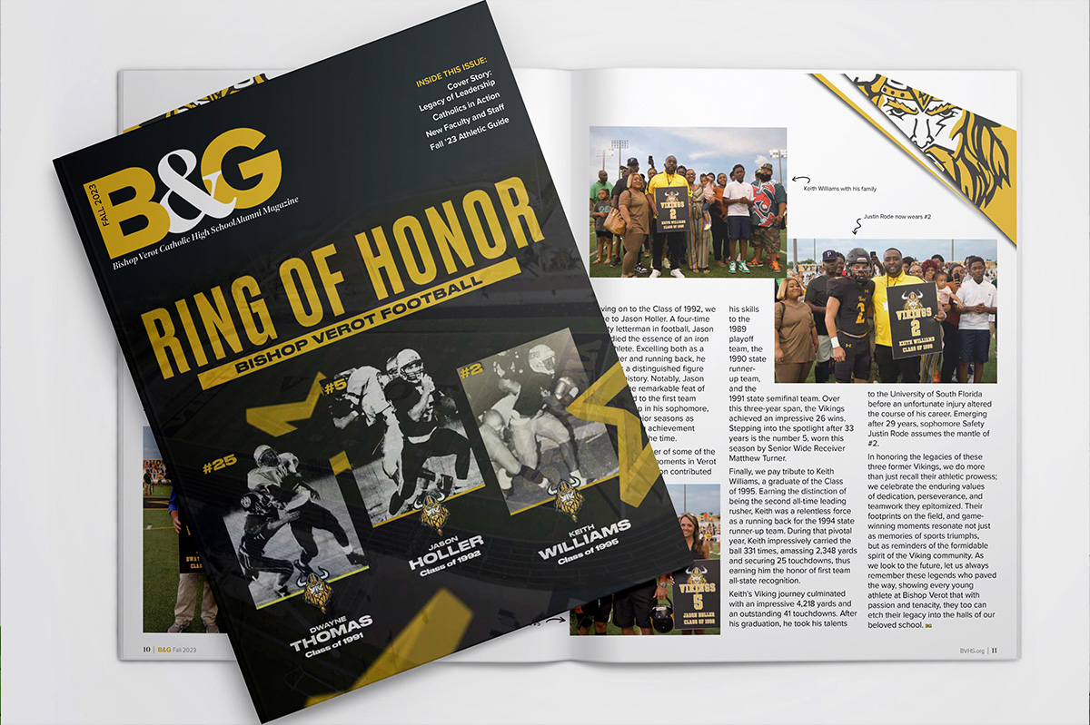
Publication Design*+
Magazine Design & Layout | Art Direction
My role as creative director of the magazine involves all visual aspects of the publication, collaborating closely with the school’s director to strategically structure the editorial and athletic guide sections, ensuring a cohesive and engaging layout. Click below for a full library of issues.
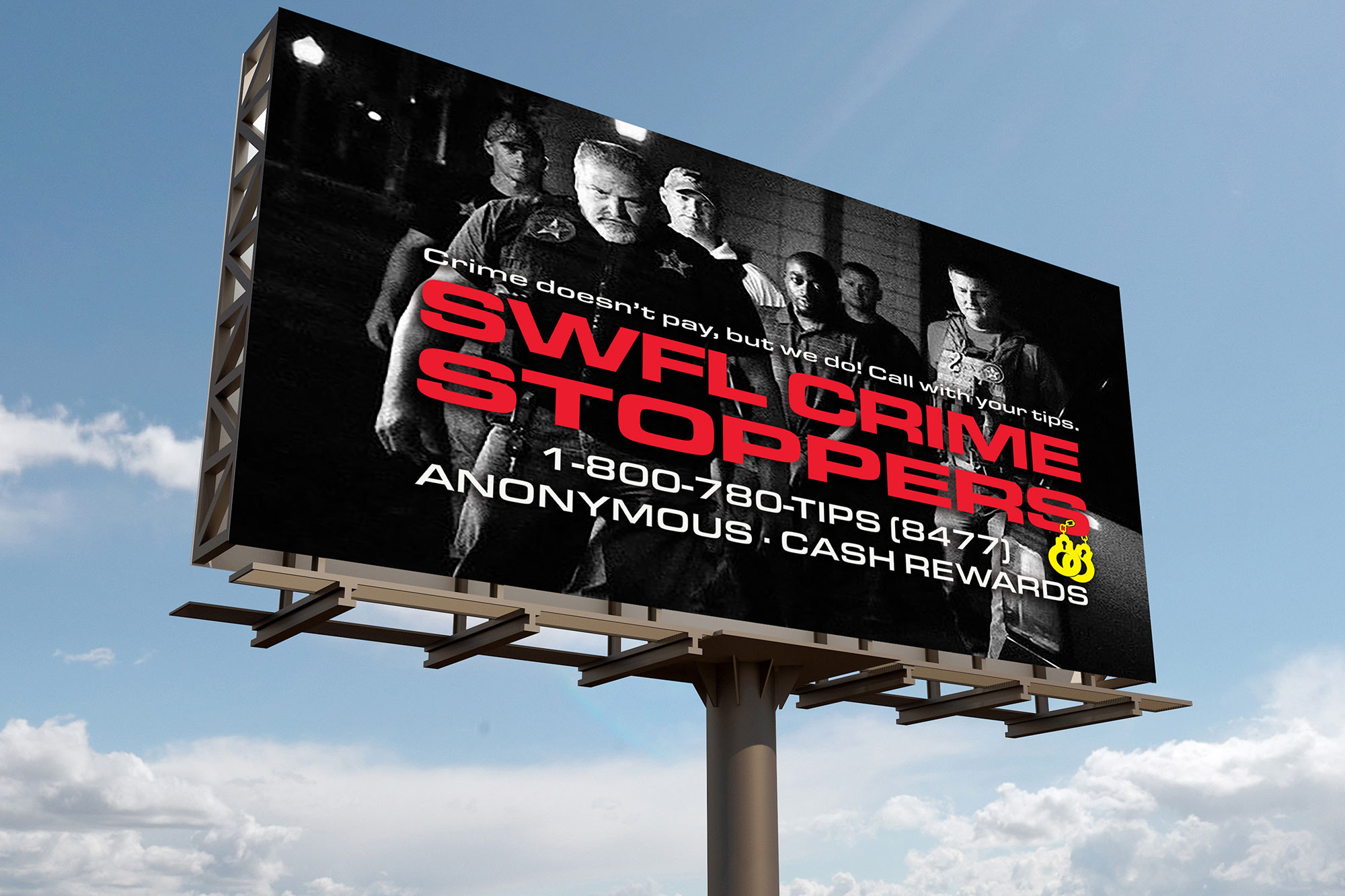
Rebrand*
Rebrand | Brand Strategy
Revitalization of the SWFL Crime Stoppers’ brand identity, with the overarching goal of unifying its visual presence across a spectrum of platforms and media outlets. This comprehensive project encompassed the creation of adaptable templates tailored for both the client’s social media utilization and the needs of various billboard companies.
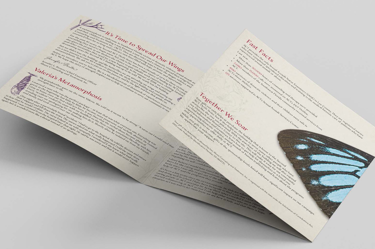
Capital Campaign Brochure*
Art Direction | Design Strategy | Content Creation | Illustration
As the design lead, I spearheaded a significant and impactful project for Abuse Counseling and Treatment (ACT), a nonprofit organization dedicated to supporting victims of domestic violence. The mission was to create a powerful and engaging capital campaign brochure that effectively conveyed the crucial services provided by ACT.
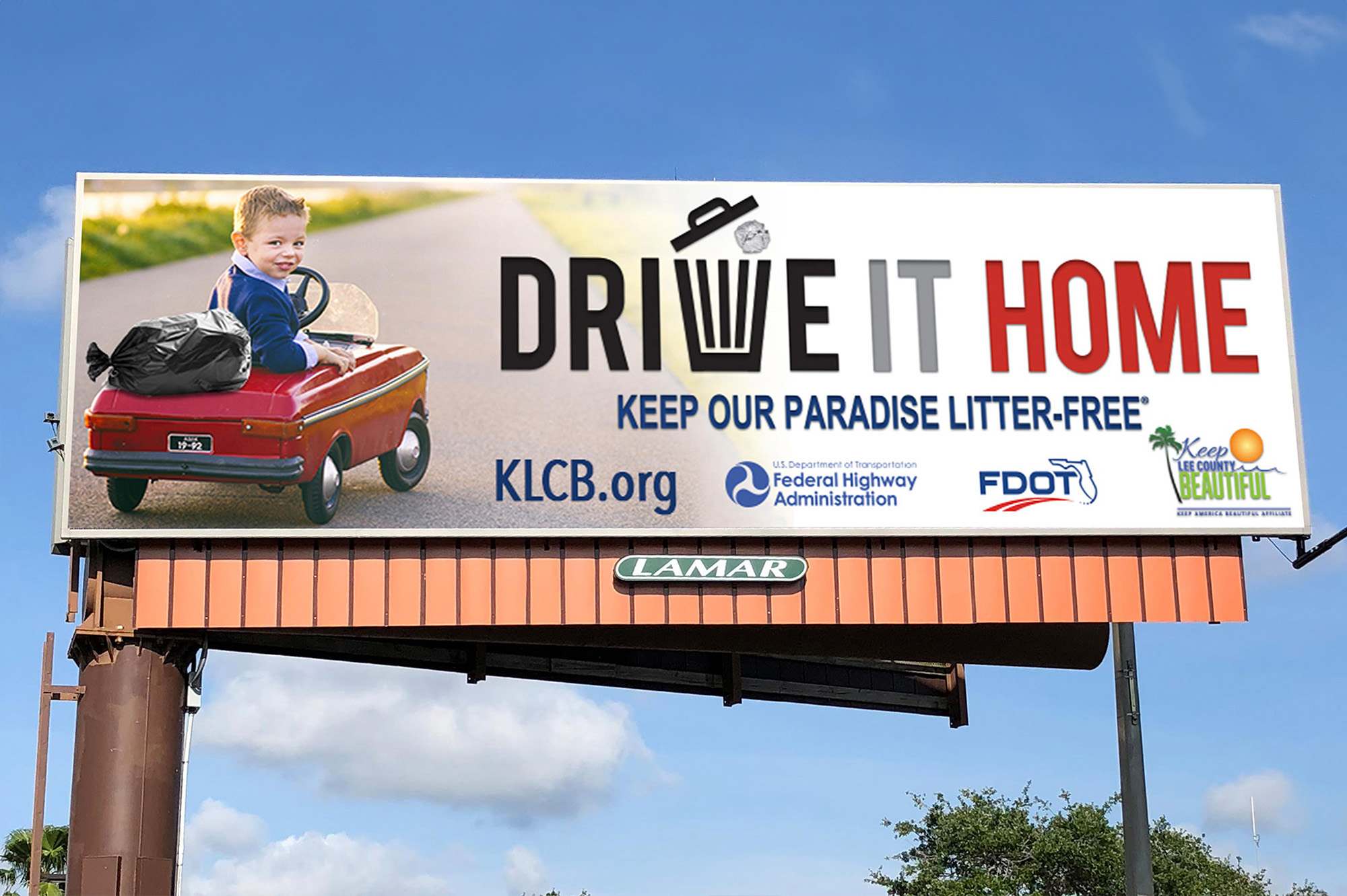
Social Media Campaign*
Billboard Design | Social Media Campaign Graphics | Visual Storytelling
An award-winning strategic marketing campaign in partnership with Keep Lee County Beautiful for Keep America Beautiful’s Great American Cleanup campaign. The campaign initiative was “Drive It Home.” It encouraged drivers to avoid littering along roadways by keeping any trash in their vehicles until they arrive at their destination.
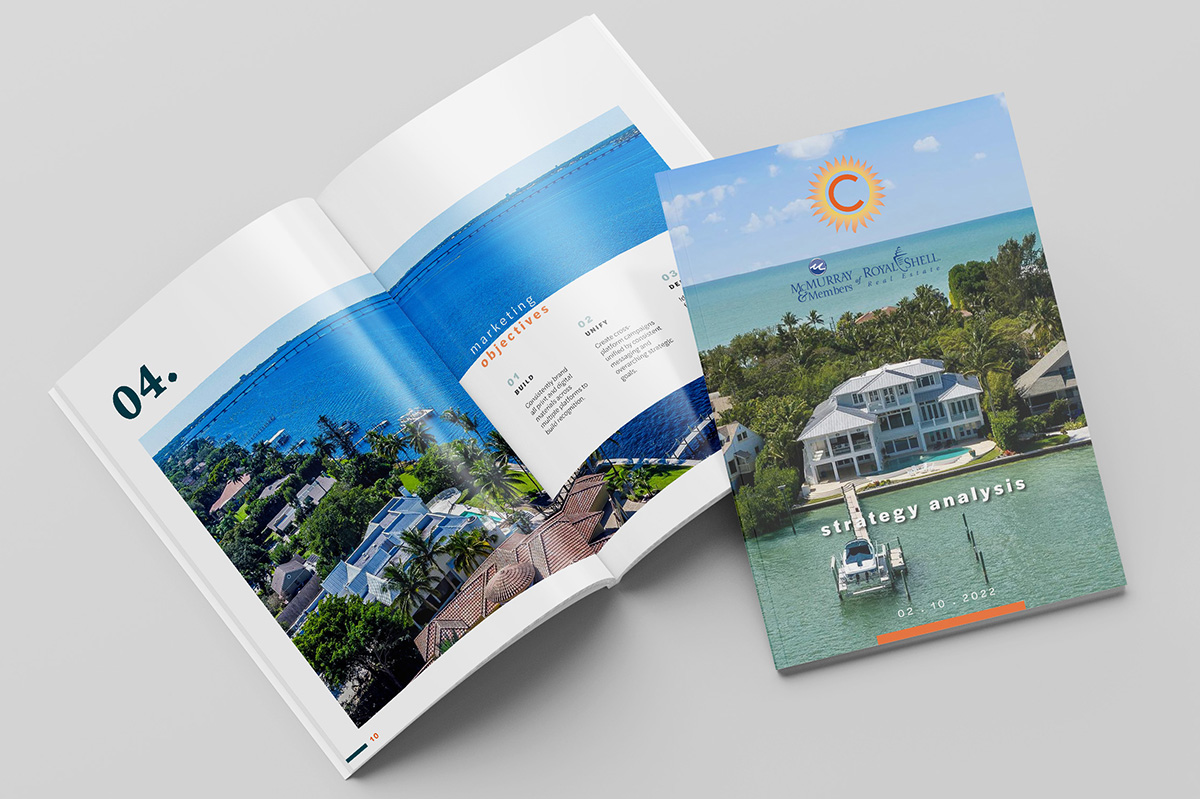
Presentation Booklet Design*
Art Direction | Layout
A strategy analysis presentation booklet was created for a prospective client to evaluate their current social media platforms and website and to propose a strategic marketing plan.
Rebrand for a Non-Profit*
Logo Design | Visual Branding
The project consisted of designing a logo and establishing a cohesive branding identity for an educational non-profit organization. This project involved skillfully blending the city’s beloved burrowing owl mascot with books, encapsulating both the local symbolism and the educational mission.
Event Logo*
Event Logo | Advertising Graphics
Developed an overarching strategy for an award created by our client. My responsibilities for the project included logo creation, trophy selection to align with the theme, advertising and event promotional graphics.
* project was completed while employed with CONRIC pr + marketing prior to 7.31.2023. ^Created in collaboration with Driven by Design LLC. +Originally a CONRIC client, I worked with—now happily continuing their journey with ABdesignerd.
Ready to make your brand look as fabulous as you know it is?
Contact me today to give your visuals the glow-up they deserve. Let’s turn heads together!